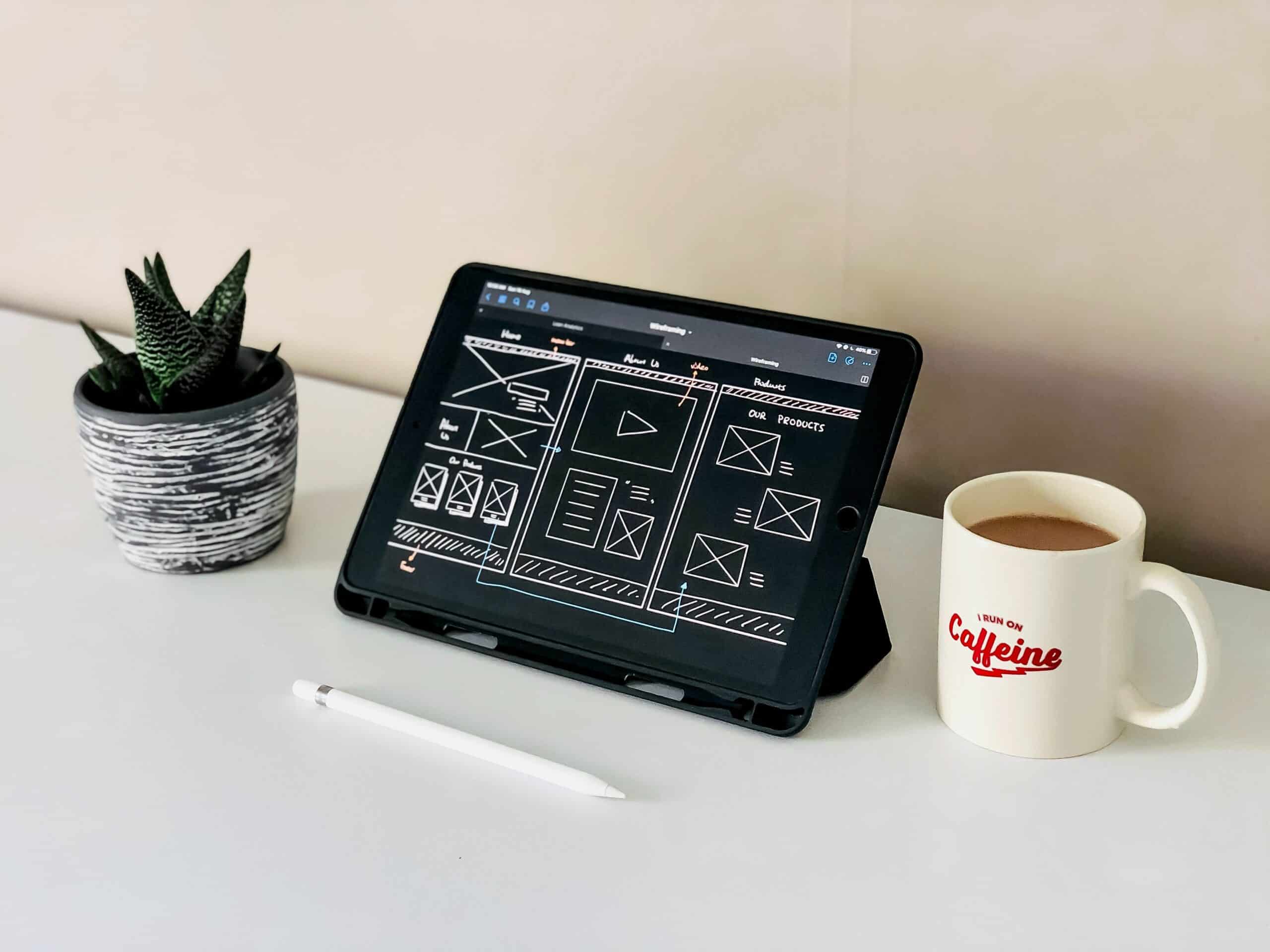
We want to help you gain the most amount of traction for the content you work so hard to produce. In this article you’ll be able to pick up some tips and tricks on the best way to design your website!
There are many different paths your website can take when it comes to design: it can be anything from classy to minimalistic, from lively and vivid to sleek and futuristic.
While your final look and feel should reflect your personal style, line of work, and company identification, there are some general guidelines to follow.
Great site design contributes greatly to your user experience. For this reason, we’ve compiled a list of easy website design suggestions to help you make your site effective.
Choose Your Color Scheme Carefully
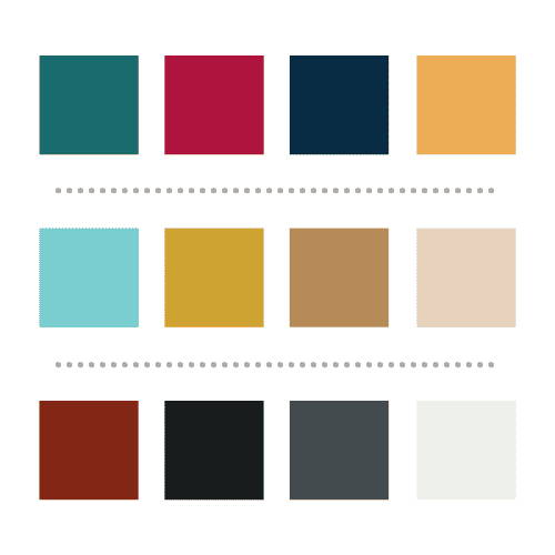
Color schemes, like fonts and backgrounds, can have a significant impact on your brand’s image and the initial attraction of your website.
Vibrant colors and high-contrast color combinations are avoided by many high-end brands. Subtle hues appear more professional and less “cheap.” These subtle hues also won’t compete with any travel imagery used that will help inspire travel lust.
Free online tools like Adobe Color are ideal for professional and novice designers who want to browse through various color schemes or build their own.
When it comes to curating the right colors for different elements of your site, its best to use more neutral tones for backgrounds while reserving pops of color for smaller elements like icons, section titles, and calls-to-action. Most well designed sites tend to stick to either a white background or a black background, keeping the site at maximum readability and preserving the aesthetic appeal.
Choose the Right Fonts
Make sure your text is easy for everyone to read across all platforms and on all devices. Picking the right font is essential to the design and flow of a website. If the font is hard to read, site visitors are far less likely to stick around and read what you’ve got to say. Your text should have a good contrast with your background and fit in well with your brand image and logo.
Also, don’t shy away from using popular fonts: your colors and logo will be what makes your brand unique. Using familiar fonts for large blocks of text will enhance readability for your site visitors and you will be more likely to find your font available on a variety of design tools.
Use a Visual Hierarchy
It’s crucial to consider where you put things on your website. Humans are visual creatures, so presenting information in a way that they can understand is crucial to capturing their attention and ensuring that they retain the information you’re giving them.
When we read, our eyes naturally follow a path, and you want to guide them with well-placed content by leading their eyes in a natural way. Putting more important things in a larger format and closer to the top of the page will help guide your users to experience the website the way you intend them to.
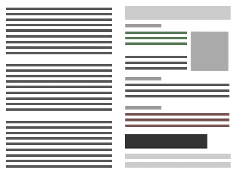
photo from vikingcodeschool.com
Use a Call to Action
Calls to action are critical for bringing visitors to where they need to go. When users come to your website, they usually have a certain purpose in mind, but they aren’t always sure where they should go. Having colorful buttons that draw their attention is a terrific approach to guide people to their destination while also improving their impression of your website.
When selling experiences, you’ll want to include strong calls-to-action at each stage of the customer journey: consideration, evaluation, acquisition, and retentionL
- In the consideration phase, you can leverage your design to inspire travel lust. For example, using eye catching scenary to get users to read a blog post
- In the evaluation phase, your design and call to action should not overwhelm your customers. It should be used to help influence their decision. Remember to use the KISS princle (keep it simple, stupid!).
- In the acquisition phase, you want a strong call to action that encourages users to take the desired action. There should only be one action that users can take in this phase.
- In the retention phase, you’ll want to rely on design to evoke emotions – for example, evoking the memory of their favorite trip through imagery or even other traveler reviews.
Use White Space
Whitespace is an often overlooked element in web design, but it will make or break your design. Giving whitespace around content on all angles really makes elements of your website stand out. Adding much needed breaks between content draws in the eye and makes content more legible and less cluttered.
When thinking about white space and spacing in general, be aware of banner blindness. Banner or Ad blindness is when a website visitor consciously or unconsciously ignores ads, or content placed where ads usually appear. If you place your important content among banner ads, users may “go blind” to it and not click on it.
Leverage the Fold
There are still wide discussions as to whether “the fold” is still a relevant design element to keep in mind. Some argue that the fold no longer matters because of the wide range of screen sizes available nowaday. But a human’s attention span lasts only 8 seconds. This means that your content has to inspire, delight, and be seen as useful by your target audience … in less than eight seconds.
So it appears that the fold is still important. For your website, this involves prioritizing your content and making the most of the limited space to entice readers to stay. Here are a few pointers on how to go about it:
Make a clear and descriptive headline
Explain what your website can achieve for visitors and emphasize the advantages. Be succinct and utilize strong language. Short headlines can be effective, especially when paired with a strong image.
Include your major call to action
The fold is the best place to start the user journey if you want to increase conversions. At this point you’re users will be in either the “consideration” or “evaluation” phase of the customer journey as discussed above.
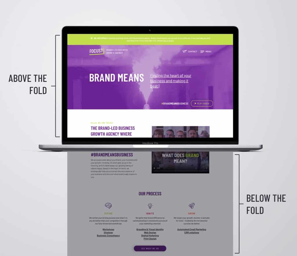
image from focus 7 international
Stay Mobile Friendly
No matter what device they’re using, all of your site visitors should be able to appreciate your professional website at its finest.
48 percent of users say that if a business’ website is not mobile-friendly, they’ll take it as an indication that the business simply doesn’t care (SAG IPL). Even more, think about your customers while they are in destination – they’re most likely to be using a mobile device.
Examine your site’s mobile version from the view of the user and test each page, user action, and button.
Consider limiting page components and scaling down some assets, such as the menu, to make your mobile website cleaner and less cluttered than your desktop version. You can also employ mobile only features to improve your mobile design. It’s important to strike a good balance between functionality and design. You want your website visitors to easily navigate the interface. If a website is too hard to consume on mobile, most users will go to a different site.
Also, consider making your menu and navigation “sticky” (i.e. that they follow the user as they scroll throughout the page). This will improve navigation and usability.
Add Viator Tools
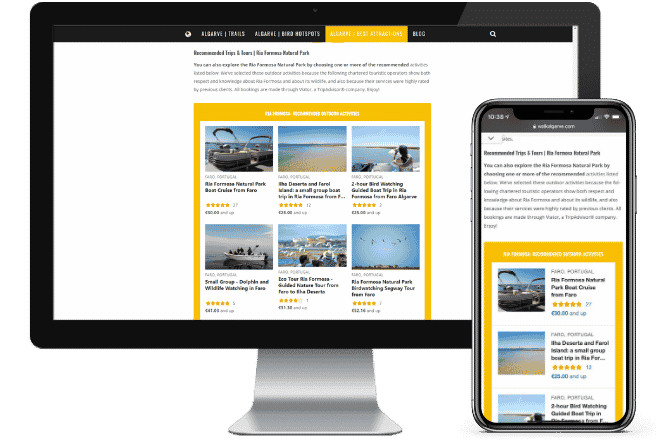
Our Viator widget and links ensure your customers won’t stray from your website to book their next great experience. Adding them to your website is as easy as a few clicks! Check out our step by step articles for both the widget and links to learn how.
Links are very effective in blog content to help inspire your customers. Our banner and widget solutions use a lot of imagry that can grab your customers’ attention. Our widgets also come merchandised with review ratings, prices, and titles that can help a user take an action in the “evaluation” phase of the customer journey.
Test, Analyze and Change as Needed
Any website builder should have tools in place for you to be able to track how many people are visiting your site, where your site is ranking from an SEO standpoint (check out our SEO article to improve your standing) and what people are clicking on and responding to. The main statistics you want to keep your eye on are
- bounce rate – the amount of people that looked at your website and quickly logged off (did the bounce rate improve after a redesign?)
- engagement – how long are people spending on your site, what are they clicking on?
- conversion rate- are visitors actually going through and converting (making a purchase, scheduling a booking, contacting you, etc.)?
Overall, the true key to a good website is the content you create. Website design can be difficult at first but over time you’ll learn what works well for you and what doesn’t. Don’t be afraid to try something new and experiment with different tactics to most effectively reach your audience.
